CMP1014 - Assignment 1
Well well well, Photoshop... something i've always been scared of. Seems pretty overwhelming when you fire it up, which is probably the main reason why I've never really used it before.
I started by checking out BigStockPhoto.com, and listing all photos, ascending, by the number of times they have been sold. I found the top selling images to be very corporate themed ones, with the most sold image being of a woman wearing a headset microphone, as if working in a call centre. Not terribly original, but it's selling well. I did want to be a bit more creative than this, after all - my main aim wasn't to make money from this site (though I might get into 'corporate imagery' to make some money later...hehe).
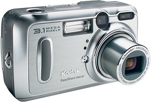
I did notice that pretty much most of the photos on the website were nicely framed, centered on the subject, and following the rule of thirds. I made sure that I stuck to those principles in my own images. Obviously, having the correct focus and shutter speed to suit the photo is essential too. I've been using my own cameras, namely a Kodak DX6340 and a FujiFilm Finepix 3800. I've had these cameras for years, so I was used to using them, I knew about all of the features, and perhaps more importantly I know they would always be available when I felt inspired.

Both cameras met the requirements, i.e. they had manual settings, semi automatic, and automatic modes. They both have at least a 3megapixel CCD (only just, but they are getting on a bit...) and I felt very comfortable using them.
Our group decided on two themes; one being the four elements (fire, earth, water, wind) and one being musical technology and instruments. At first I had intended to focus mainly on musical instruments, as we have a (basic) practise room in our house, filled with instruments and some recording gear. I began however, by going out and taking photographs out and about.
I had planned to go home to Bristol for a weekend, naturally I took plenty of photos there as I thought that it might be more interesting to get a variety of sources, as I imagined a lot of people would be photographing swans, ducks, and perhaps just the Brayford in general. To me - that had been done plenty of times before, and wasn't even an option.

I started by checking out BigStockPhoto.com, and listing all photos, ascending, by the number of times they have been sold. I found the top selling images to be very corporate themed ones, with the most sold image being of a woman wearing a headset microphone, as if working in a call centre. Not terribly original, but it's selling well. I did want to be a bit more creative than this, after all - my main aim wasn't to make money from this site (though I might get into 'corporate imagery' to make some money later...hehe).
I did notice that pretty much most of the photos on the website were nicely framed, centered on the subject, and following the rule of thirds. I made sure that I stuck to those principles in my own images. Obviously, having the correct focus and shutter speed to suit the photo is essential too. I've been using my own cameras, namely a Kodak DX6340 and a FujiFilm Finepix 3800. I've had these cameras for years, so I was used to using them, I knew about all of the features, and perhaps more importantly I know they would always be available when I felt inspired.
Both cameras met the requirements, i.e. they had manual settings, semi automatic, and automatic modes. They both have at least a 3megapixel CCD (only just, but they are getting on a bit...) and I felt very comfortable using them.
Our group decided on two themes; one being the four elements (fire, earth, water, wind) and one being musical technology and instruments. At first I had intended to focus mainly on musical instruments, as we have a (basic) practise room in our house, filled with instruments and some recording gear. I began however, by going out and taking photographs out and about.
I had planned to go home to Bristol for a weekend, naturally I took plenty of photos there as I thought that it might be more interesting to get a variety of sources, as I imagined a lot of people would be photographing swans, ducks, and perhaps just the Brayford in general. To me - that had been done plenty of times before, and wasn't even an option.

Then, I began taking some photos. I've always been very interested in abstract photography, in particular, making something look like something else. The photograph above was taken using my Kodak camera, with a 4 second shutter speed, and a torch. I waved the torch around infront of the camera in an attempt to create flamelike licks of light. Using some post production in Photoshop I made the licks of light appear from the bottom of the image upwards, as opposed to occuring at an angle as they did in the shot.
After photoshopping, the image looked like this:

After photoshopping, the image looked like this:

By changing the colour of the background ever so slightly, I was able to create a sense of warmth. Previously, the background was almost completely black, which was a nice contrast to the flames, but looked very cold. I moved around some of the flames, and used the Blur effect to diminish some of the lines where it was evident where it had been cut. Then I cropped the image to be focussing on the main subject (i.e. the flames).
On the 5th of November, as well as celebrating Guy Fawkes blowing up the houses of Parliament, I took some more photographs. I thought that one of the biggest fire-based events of the year, would be an excellent opportunity to capture some images of fire.
 This is the unprocessed, raw image as captured with my Kodak camera. It clearly depicts a silhouette of a person waving a sparkler around. I was quite pleased with how this shot came out, and how easy it was to capture what I wanted to capture.
The person in the image isn't identifiable, which meant I did not need to submit a model release form to Big Stock Photo.
As far as post production goes, a quick touchup in photoshop; in terms of contrast, saturation, and cleaning up rough bits around the edges, the image was complete.
 I also cropped the image a little bit, removing mainly a few pixels from the right hand side. Adjusted the saturation and contrast a little, just to bring the vividness, and brightness of the sparkler out a bit more.
For my next trick, I will be manipulating an image of an Alesis mixer, which I use in our practise which I talked about above. I ensured that no brand names were visible on the mixer, to make sure that I wasn't infringing on any copyright laws.
 This is the original image of the mixer. I'm not 100% best pleased with it really, though using Photoshop I was able to crop it to focus on the knobs on the mixer, and remove the messy cables on the top row, as well as the background behind it.
I chose to take the photo from this angle, as a perspective view such as this gives a sense of control, which one would have with such a mixer.
I intentionally left the mixer in a dusty, slightly untidy way as this would suggest it's been heavily used for mixing.
 This is a slightly different image to the one above, from a slightly lower angle, and focussed very much on the knob in the centre of the image. This image follows the rule of thirds very well, with the main subject (i.e. the Level 2 Volume knob) being in focus, with the rest of the knobs gradually losing focus as they leave the centre of the image.
I sharpened the image slightly in photoshop, cropped away any intidyness, and slightly increased the saturation. The lighting in this room is very good in the morning, which is when I took this shot.
The next image could fall into both themes (elements, and musical instruments / technology). This is the top cone from a Wharfdale Xarus 5000, which I took in the evening, illuminated with a halogen light. I didn't realise how dusty these were till I took this image, but again I didn't want it to look too perfect.
 This once again, is the raw image as the camera saw it. I used the macro mode on the camera, since the subject was around 10cm away from the lens.
As I said, I used a 50Watt halogen bulb, shining up at the speaker from underneath, which produced that shine on the centre of the cone, and which also made the dust show up more than usual (which was... erm... intentional).
The image does not show the left and right edges of the cone, which I thought framed the image very nicely, as it's not neccessarily important to see these, as the top and bottom of the image are visible, and one would assume that the cone is circular.
Post Photoshop Images:


Both of these images have been processed using photoshop, but I adjusted the colour of the second image to be more true to the colour of the actual cone. While the second image is a more accurate representation of the original, I think the first image looks much warmer because of the halogen light, and the way in which this would have affected the camera's automatic setting under incandescent light.
I submitted the first of the two photos to BigStockPhoto.
Next, I will be looking at the technical side of the photos which I have taken, as well as the way in which I manipulated them.
I compressed all of my images using the joint picture editing group standard (.jpeg). In the photoshop export setting, I set the compression level to 10 (close to Maximum Quality) as I felt this was a good compromise between making the images small enough to be used on the web (even for slower connections such as 56k or ISDN) but decent enough quality to look adequate for print. Obviously, had my main priority been to capture images for print I would have used much higher quality images, captured with a much higher quality CCD on a camera. Since the task was to produce images to go on a website, I thought I should focus on making them compatible for the web.
One of the downsides of using JPEG compression is that occasionally jpeg artefacts can occur, in particular at higher compression levels.


MY BIGSTOCKPHOTO USERNAME IS = velkrosmaak
MY ENROLMENT NUMBER IS = 042408048
On the 5th of November, as well as celebrating Guy Fawkes blowing up the houses of Parliament, I took some more photographs. I thought that one of the biggest fire-based events of the year, would be an excellent opportunity to capture some images of fire.
 This is the unprocessed, raw image as captured with my Kodak camera. It clearly depicts a silhouette of a person waving a sparkler around. I was quite pleased with how this shot came out, and how easy it was to capture what I wanted to capture.
The person in the image isn't identifiable, which meant I did not need to submit a model release form to Big Stock Photo.
As far as post production goes, a quick touchup in photoshop; in terms of contrast, saturation, and cleaning up rough bits around the edges, the image was complete.
 I also cropped the image a little bit, removing mainly a few pixels from the right hand side. Adjusted the saturation and contrast a little, just to bring the vividness, and brightness of the sparkler out a bit more.
For my next trick, I will be manipulating an image of an Alesis mixer, which I use in our practise which I talked about above. I ensured that no brand names were visible on the mixer, to make sure that I wasn't infringing on any copyright laws.
 This is the original image of the mixer. I'm not 100% best pleased with it really, though using Photoshop I was able to crop it to focus on the knobs on the mixer, and remove the messy cables on the top row, as well as the background behind it.
I chose to take the photo from this angle, as a perspective view such as this gives a sense of control, which one would have with such a mixer.
I intentionally left the mixer in a dusty, slightly untidy way as this would suggest it's been heavily used for mixing.
 This is a slightly different image to the one above, from a slightly lower angle, and focussed very much on the knob in the centre of the image. This image follows the rule of thirds very well, with the main subject (i.e. the Level 2 Volume knob) being in focus, with the rest of the knobs gradually losing focus as they leave the centre of the image.
I sharpened the image slightly in photoshop, cropped away any intidyness, and slightly increased the saturation. The lighting in this room is very good in the morning, which is when I took this shot.
The next image could fall into both themes (elements, and musical instruments / technology). This is the top cone from a Wharfdale Xarus 5000, which I took in the evening, illuminated with a halogen light. I didn't realise how dusty these were till I took this image, but again I didn't want it to look too perfect.
 This once again, is the raw image as the camera saw it. I used the macro mode on the camera, since the subject was around 10cm away from the lens.
As I said, I used a 50Watt halogen bulb, shining up at the speaker from underneath, which produced that shine on the centre of the cone, and which also made the dust show up more than usual (which was... erm... intentional).
The image does not show the left and right edges of the cone, which I thought framed the image very nicely, as it's not neccessarily important to see these, as the top and bottom of the image are visible, and one would assume that the cone is circular.
Post Photoshop Images:


Both of these images have been processed using photoshop, but I adjusted the colour of the second image to be more true to the colour of the actual cone. While the second image is a more accurate representation of the original, I think the first image looks much warmer because of the halogen light, and the way in which this would have affected the camera's automatic setting under incandescent light.
I submitted the first of the two photos to BigStockPhoto.
Next, I will be looking at the technical side of the photos which I have taken, as well as the way in which I manipulated them.
I compressed all of my images using the joint picture editing group standard (.jpeg). In the photoshop export setting, I set the compression level to 10 (close to Maximum Quality) as I felt this was a good compromise between making the images small enough to be used on the web (even for slower connections such as 56k or ISDN) but decent enough quality to look adequate for print. Obviously, had my main priority been to capture images for print I would have used much higher quality images, captured with a much higher quality CCD on a camera. Since the task was to produce images to go on a website, I thought I should focus on making them compatible for the web.
One of the downsides of using JPEG compression is that occasionally jpeg artefacts can occur, in particular at higher compression levels.
The image on the left has been compressed 3 times, using jpeg compression, and the image on the right is not compressed at all. This is one of the biggest downsides to the jpeg compression standard, though it does create very small file sizes. Compromises have to be made, by finding the best quality, for the best filesize.
The relationship between the size of the image, and the size of the image if it was to be printed can be calculated as follows:
If I had a 640x480 pixel image, and was to print this at 200dpi I would calculate the size of the print as follows:
640 / 200 = 3.2
480 / 200 = 2.4
This means, at 200dpi, the image would be 3.2 by 2.4 inches.
MY BIGSTOCKPHOTO USERNAME IS = velkrosmaak
MY ENROLMENT NUMBER IS = 042408048
posted by Velkro Smaak at 11:35 am
0 comments
![]()
![]()